What is Office 365 for business?
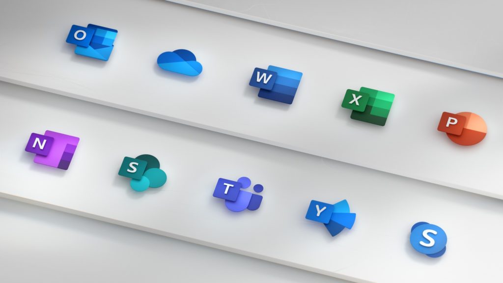
March 11, 2019Microsoft has revealed all-new Office 365 app icons with bolder, lighter hues, combined with simplistic visuals and instantly recognizable symbols.
Introduced via a Microsoft Design post on Medium, each icon was designed to decouple the individual letters and symbols to maintain familiarity while keeping a focus on simplicity.
The new icon designs for Word, PowerPoint, Excel, Skype, Teams and more, will be pushed out to nearly one billion Office users across the world over the next few months, replacing the existing icons which were released in 2013.
Check out the new icons below, and click on through to Medium for the full philosophy behind the new designs: